TurboTax - Cart

HOW MIGHT WE IMPROVE THE CART EXPERIENCE FOR USERS IN MEANINGFUL WAYS?

The TurboTax Cart needed an overhaul because it was unnecessarily complex for users. During a given tax season 31 million users file their taxes with TurboTax and the cart experience can be a stressful moment for users. The cart is also a moment of truth for the TurboTax brand. To address this challenge, I sought out ways to make information for easily accessible to users, answer their questions and keep the UX simple and incredibly easy to navigate. Simplification, in-line answers and collapsed pages streamlined the process into a single page and allowed for a format that users were familiar with given other cart experiences.

Type: App & Service
Client: Intuit
Role: Interaction Design and Strategy


Testing & Communicating Change

Measuring what is made gave me a platform to explain success. Not only for senior leadership and stakeholders, but for the design teams to track our iterations and scoping across research and development sprints.
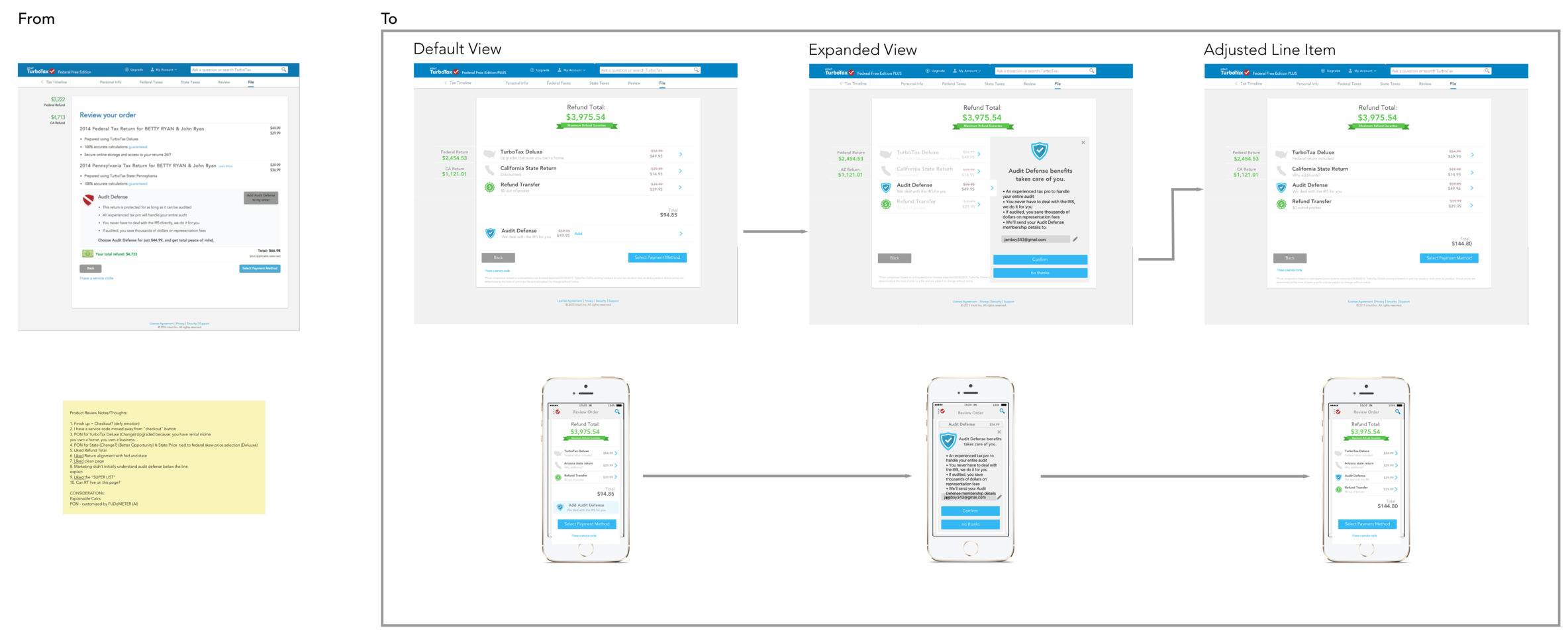
RYO - Struggler Considerations2.png


Responsive Design

Throughout the iterative cycle and implementation, understanding how the design would render across various devices and sizes was explored, solved and documented. Understanding how the user interpreted the messaging of our interaction design gave us the confidence to work with the developers on rules and solutions to keep it elegant.
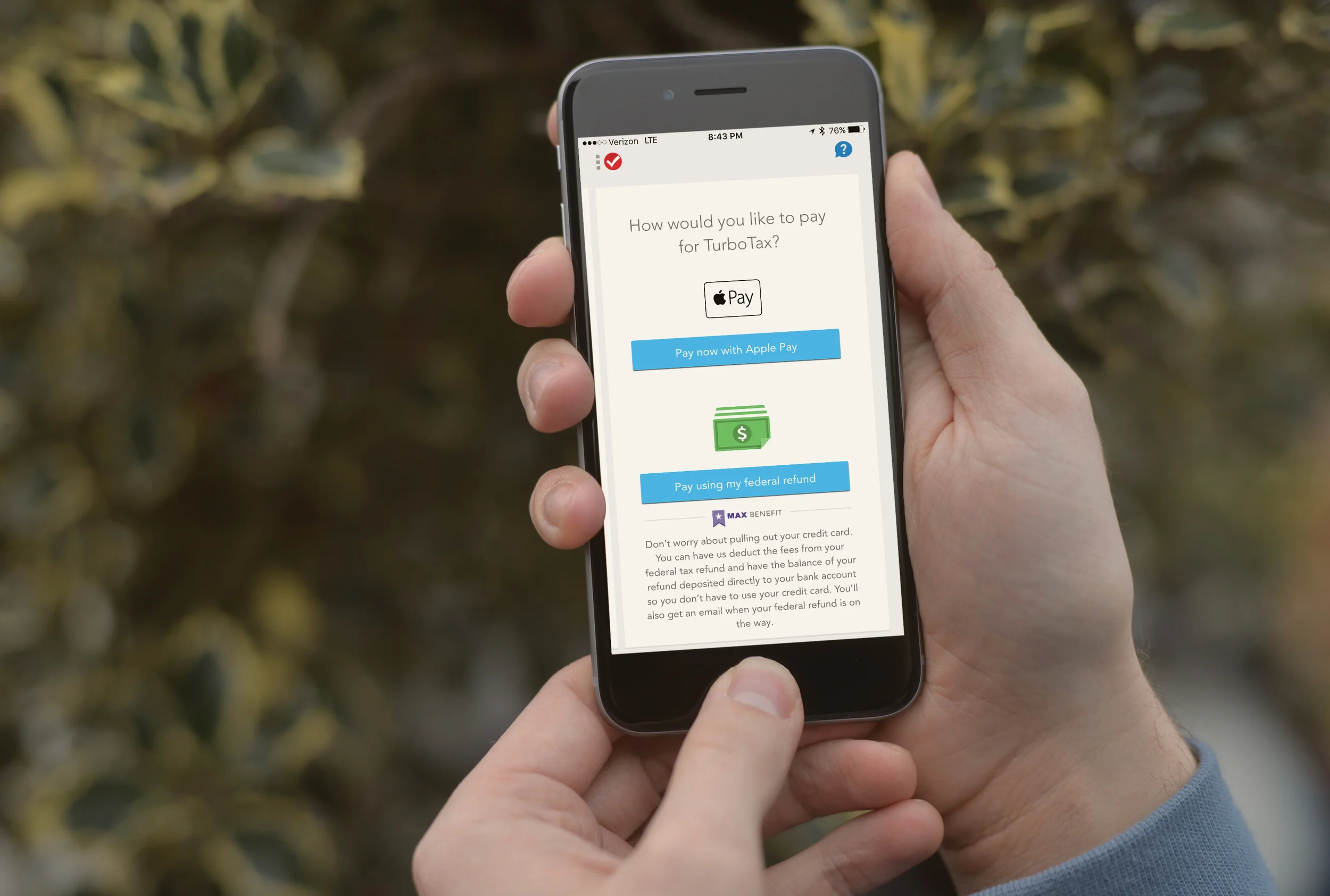
Cognitive Burden Test.png


Upfront & Honest

Throughout the user experience, I uncovered ways to be more clear and honest to users. One example in the image above highlights the users refund total. In the past version of this screen, that info was buried and confusing. User feedback on these sort of improvements was extremely positive.


User Questions

While doing taxes, users often have questions about individual line items. For general details of a line item, users can tap the carrot on the right which opens an info modal. While this answers general questions, the most common question or benefit is surfaced just below the line item (eg: Why TurboTax Deluxe?), which goes to a more complete view of benefits. 


Before & After

Originally, this screen was full of text (see image: top left) that confused and exhausted users. By collapsing all text into expandable line items, users now see everything in one glance, expand to learn more and move on to the next step more easily.

TurboTax - Apple Pay

HOW MIGHT WE DELIVER THE APPLE PAY EXPERIENCE WITHIN TURBOTAX?

Type: App & Service
Client: Intuit
Role: Interaction Design and Strategy

The first-ever integration of Apple Pay into TurboTax was a rewarding process. Prior to this project, TurboTax did not have Apple Pay, but the product needed it to improve the tax payment experience. To accomplish this, I worked to ensure that Apple Pay would fit into the complex web of possible flows and stated requirements. The project was a complete success due to the integrity, thoroughness, and rigor of our design process and ultimate design decisions. It resulted in no bugs, a significant increase in ARPC, and completely satisfied users at launch and beyond.

Communicating Success

By identifying the 12+ unique flows, we uncovered opportunities to make this more simple and how Apple Pay could be integrated seamlessly. This set of flows helped align the team, QA testing and knowing we thought through every possible situation helped with Apple’s approval.

Co-Op Camera

How might we enable people to automatically have an enhanced experience of an event they attended?

How might we enable anyone access high production value with the touch of a button?

How might we create a new level of interactive community?


User Journey


1) Capture

Imagine your at your favorite concert and you could access 100's of other camera's to grab the video from all angles. Imagine if those different angles could stitch the images together for a "flying" affect through the crowd up too front row. It could pan around you as the focal point. 

UX Opportunities

  • Capture 360 photos & video
  • Custom capture app
  • Alert user to number of people sharing photos & video from the event
  • Allow users to instantly view other peoples camera streams

Tech Opportunities

  • Hyper-local coordinate system
  • Optimized multi-lense capture processor
  • Optimized multi-device asset processor
  • Optimized up resolution processor
 

2) Share

After capturing video, the user simply hashtags #co-op-cam with the upload to instantly becomes part of the community. Here is where you can change visibility levels to become more broad or specific. 

UX Opportunities

  • Share on facebook, instagram twitter with hashtag #co-op-cam
  • Select Visibility
    • Radius
    • Duration or event specific
    • Friends or friend-of-friend
    • Cupid

Tech Opportunities

  • Proprietary Camera App
  • Integration with social media
  • Enter videographer contest
 

3) Notify

Alerts then happen to let you know if other friends are around of if there is a video ready for you. Another option that comes into play is "cupid" mode. You can choose how immersed you would like to be in the community by even finding new friends. 

UX Opportunities

  • Video is ready to watch
  • Friends suggestion
  • Friends are nearby
  • Cupid arrow
  • New opportunities to join current live moments/events.

Tech Opportunities

  • Enhanced location chip to communicate coordinates with other mobile cameras.
  • Sound branding tone for alerts, activation and interface confirmation.
 

4) Watch

This is the best part. Watching the automatically edited video that has grabbed all the best audio and video sources and creatively cuts the timeline of optimized video of you, your friends and anyone else you chose. 

UX Opportunities

  • Watch!

Tech Opportunities

  • Auto generated video cuts
 

5) Edit

Once the video has been created you have the option to randomize for another version, select specific focal points or even manually cut your own video.

UX Opportunities

  • Randomizer
  • Guide edit with focal points
  • Manually edit
  • Select friends to include
  • Save & share new edit

Tech Opportunities

  • Smart robot prioritizes footage with audio and location analysis
  • Cloud based software and/or proprietary chip to enable filters and edits
  • Mixing room and video room have opportunity to give feeds of footage to co-op cam
  • Sponsored footage for review
 

Monster Moves App


Kickoff

HOW MIGHT WE TEACH RHYTHM AND COMPOSITION WITH AN INTERACTIVE IPAD EXPERIENCE?

How might we create a multi-player musical app for ages 3-5 that's intuitive, rewarding and fun?

How might we create a more dynamic game then what existed in the market and allowed users more choices within the interaction. 


Concepts

  • Monster Interactions
    • Play instruments or sing              
    • Make sounds while dancing
    • Play together or solo
  • Musical Elements
    • Melodies, SFX or Both
    • Rhythm structure
    • Division/Orchestration between monsters and musical melody
 

Prototype

The first prototype of musical phrases was successful and helped define the language direction and flow of the game.

  • Created mobile prototype for usability test
  • Sync dance moves and audio
  • Tried 2-6 monsters in the game at the same time
  • Created multiple versions for usability testing to determine how many choices is to much or too little
 

Collaboration

Keeping things organized allowed the team to work in parallel. This made our creative process more efficient and inspiring. In particular, we could influence each other with new perspective and results along the way. 

  • Sounds influenced character development, timing and dance move style
  • Dance moves inspired new options to improve melodies
  • I used a spreadsheet to keep track of progress and real-time updates
 

User Feedback

User feedback gave us new opportunities for refinement and points of fun. Additionally, the user perspective helped to widen our targeted age group.

What worked

  • Monsters are fun to interact with
  • Overall sound is great
  • Foreshadowing music is working for background during selection

Opportunities

  • Make start button more noticeable
  • Automate next step after selection process is completed
  • Create an intro and finale to the game with all monsters
 

Final Product

  • Increased original proposal for market reach. Appeals to users age 2-10
  • The game was a huge success with client and is set to launch in the summer of 2015